May 10, 2023
Even though we’re already well into the new year, it’s never too late to start revamping your website and incorporating new design trends that will captivate your audience.
Your website is often the first point of contact with your customers, so making a good first impression is important. We’ve compiled some of the best website design trends that are already making waves in 2023. Incorporating a few of these ideas into your existing company website might just set you apart from the competition!
Why You Should Constantly Update Your Site
First things first, why should you be updating your website regularly? The answer is simple: your website is your online storefront. Just as you would keep a physical storefront clean, organized, and visually appealing, your website should be the same. Keeping your site updated with fresh content and modern design elements shows that you are a trustworthy and relevant business.
Additionally, a regularly updated site can improve your search engine optimization (SEO) ranking. Google favors sites with fresh, relevant content and will reward them with a higher ranking. Updating your site also allows you to incorporate new technologies and trends, making it easier for visitors to navigate and engage with your content.
Trends to Watch
With each passing year, new design trends emerge, and 2023 is no exception. Here are a few of the most popular trends this year to watch out for!
Dark Mode
This design trend has been gaining popularity for some time, and it's not going away anytime soon. This user interface design option allows users to switch the color scheme of the website from light to dark, reducing eye strain and improving readability. Users can usually change a site from light to dark mode through the settings or preferences menu of an app or website. Dark mode can be easier on the eyes, and give your site a modern and sleek look.

Gradients
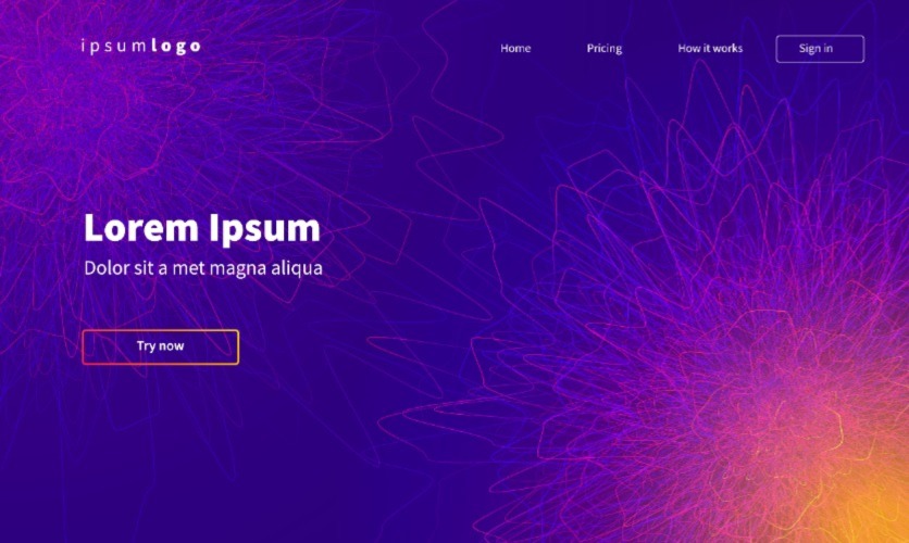
Chances are if you’ve been only shopping lately, you’ve been seeing a lot of fun color gradients! These shaded areas are super trendy at the moment, representing modern boutiques and new hipster brands. Adding color gradients to your site's design can add depth and interest. Soft, subtle gradients are popular for creating a sense of calm, while bold and bright gradients are ideal for a more energetic feel.
3D Elements
Using 3D elements on your site creates an immersive experience for visitors. From scrolling animations to 3D product displays, this trend adds a sense of depth and realism to your site. It also makes your brand appear forward-thinking and up-to-date with technological advancements.

Building Trust with Customer Proof
Incorporating testimonials, reviews, and general social proof on your website is a powerful way to build trust with potential customers. People want to see that the product or service you’re selling actually works! It can be hard to trust businesses online these days, and including social proof on your site is a great way to be more trustworthy.
Customer proof can include testimonials, reviews, or case studies that showcase your product or service. It shows visitors that you are a reputable business and that others have had positive experiences with your brand. Don’t be afraid to get creative with multimedia testimonials or portfolio work.
When incorporating customer proof, make sure it's easy to find and visually appealing. You can include customer quotes on your landing page, showcase case studies on a dedicated “our work” page, or feature reviews on product pages.

Mobile-Specific Features
With the majority of internet traffic coming from mobile devices, it's crucial to ensure that your site is easily navigable on a smaller screen and loads quickly. It's not just about being mobile-friendly– it's also about incorporating mobile-specific features to enhance the user experience.
- Adding a “click-to-call” button can make it easier for visitors to contact you directly from their mobile devices. They won’t even have to type in your number!
- Live customer service chat allows visitors to ask questions and receive immediate support without having to pick up the phone or send an email. You might have noticed many major retailers picking up this live chat feature in recent years!
- Make sure any forms on your website are optimized for mobile devices, making it easy for visitors to fill out and submit information on the go. This mostly applies to contact forms, which are important for getting that potential customer info!

Supplemental Videos
Video content has taken the internet by storm, and there is no sign of it slowing down. They're a great way to convey information in a more dynamic and engaging way than written text. This is especially important for mobile users, who may find reading lengthy text on a smaller screen difficult, boring, and tiresome.
Videos on your site should be mobile-friendly and optimized for faster loading times. You can use these videos to showcase your products, provide tutorials, or give your visitors a behind-the-scenes look at your business. Don't forget to include subtitles or captions for accessibility, and to cater to users who prefer to watch videos without sound.
New Site, New You
By implementing even just one of the trends mentioned in this article, you can bring your website into the 21st century and attract younger, more tech-savvy consumers. Not only will these modern website design trends make your business appear more legitimate and credible, but they will also improve your customers' user experience and increase their likelihood of returning to your site. Don't hesitate to try out a new design trend or feature – it may be just what you need to take your digital marketing to the next level!


